Hey everyone! Two years ago I had the opportunity to join Oppolyon Studios to work on their project Ascending inferno. From day one, I could tell that this project would not only push my technical and creative boundaries but would also allow me to collaborate with a team of passionate and talented developers.
In this post I’ll be taking you behind the scenes of my contributions to Ascending Inferno; diving into some of the challenges and features I had the opportunity to work on and showcasing some of my proudest visual effects. But before we jump into the details, let me give you a quick overview of Ascending Inferno.
Ascending Inferno is a 2.5d rage-platformer where you play as Dani, a soccer player, tragically you will die and be sent to the bottom of hell where, fortunately you encounter your brother Vincent. Unfortunately, however Vincent has taken on the form of a ball and needs your help to be kicked up the nine levels of Dante's inferno.
You can find the game here!
The game is set across ten distinct levels: The Earthly Realm (which serves as the tutorial), followed by Limbo, Lust, Gluttony, Greed, Wrath, Heresy, Violence, Fraud, and Treachery. Below, I’ll take you through some of the mechanics, visual effects, optimizations, and world-building elements that helped bring these environments to life.
Contents
- Visual Effects For Game Mechanics
- Visual Effect Overlays
- Vincent Camera - Improving Gameplay
- Optimising The Project
- Shaders
- Project Juice
- World Building Blueprints
- Set Dressing and Level Construction Challenges
- Turntables: Crafting Immersive Character Customisation
- Character Customiser: Adding Wings, Hats and Trails
- Automatic Scalability Options
- Conclusions
Visual Effects For Game Mechanics
To begin, let’s take a closer look at the particle effects and how they play a critical role in world-building and conveying information to the player. In this section, I’ll break down some of the core game mechanics, their visual effects, and the layers we added to achieve the result. I’ll also touch on some of the decorative effects that brought our world to life.
Each of our ten levels features a unique gimmick that players must understand to progress, with one exemption: Limbo. The tutorial is designed to quickly teach players how to control Dani and the soccer ball, guiding them through movement, manipulating the ball, and how the ball affects the world. It was important that we introduced the mechanics progressively as to not overwhelm them with new information and ensure smooth progression. We chose to first introduce a door – something familiar, but which required players to fully understand before they could continue forward.
Once the tutorial is completed, players are thrust into Hell, where the true challenge begins. At this point, there are few areas that feel truly safe, leaving falling between levels as a constant threat. In designing Limbo, we decided that the level itself should be challenging enough without the need for an additional gimmick. Instead, we focused on large, simple jumps and big falls. We also used Limbo as an opportunity to introduce shortcuts—secret routes that would let skilled players bypass some of the harder sections. While these shortcuts were subtle, they played an important role in the player's exploration and learning experience.
Moving on to the third level, Lust, we introduced the player’s first real obstacle: a demon whose hypnotic dance draws Vincent in before kicking him away. To bring this mechanic to life, I created three distinct visual effects: a swirling vortex around the dancer, a screen-space overlay to enhance the hypnotic effect, and a subtle blue swirl around Vincent. These effects worked together to clearly signal the mechanic’s function to the player, adding both visual clarity and thematic consistency to the level.
Next up is Gluttony. This level presented some design challenges, and we went through several iterations before settling on the final mechanic. Initially, we created sticky platforms that were supposed to make it harder to move Vincent, but this inadvertently helped players more than hindered them. To raise the difficulty, we switched to “hot” platforms. These would cause Vincent to bounce uncontrollably, eventually ejecting him if the player didn’t regain control. It was a chaotic mechanic that fit the gluttonous excess of the level perfectly.
The fifth level, Greed, was another one that took a few attempts to get right. Initially, we wanted to punish players who took too many shortcuts, but this design proved problematic as our intended shortcuts took too long to access. By this point, the level’s layout was already locked in, so we pivoted to a wind mechanic. Now, strong gusts of wind push Vincent left or right while inside the wind volume, adding an additional layer of difficulty to the level.
For Wrath, we were torn between two ideas; sinking platforms and hands that pull you through the ground. Both ideas drew inspiration from Dantes Inferno, but both presented their own design challenges. Ultimately, we decided to go with the hands. This is one of the mechanics I’m most proud of, the first iteration I made ran below 20 frames per second with only 8 sets of hands running. After a couple attempts, I was able to offload all the calculations onto the GPU through the shader, then using Unreal Engine’s foliage brush we could have them instanced anywhere. Suddenly we went from approximately 50 hands all the way up to 80,000 before we started seeing framerate issues.
Our next level Heresy is right before the checkpoint, so we wanted it to be a bit of a challenge but not completely unforgiving. We ended up making this one the moving platforms biome. Aside from a few steam and smoke visual effects there weren’t too many particles to be made here, so instead most of my time was focused on the trains.
Once players make it past the checkpoint in between Heresy and Violence it becomes impossible to fall back to the previous levels, this means that we could drastically increase the difficulty of the mechanics without them being too punishing. For Violence we wanted something that could throw Vincent off screen with a large surrounding space to ensure disaster. I was tasked with creating a “lightning” and “sphere” effect, which I interpreted as a plasma ball. Sparks would gather around the outer edge of the sphere and discharge toward the centre, creating a satisfying explosion that propels Vincent off into danger.
Fraud was all about creating the feeling of being out of place, as an impostor. To reinforce this, we designed a stage that our player would run along with a grand audience behind them, watching all their movements. Our mechanic for this one was going to be false platforms driven by what was and was not in light. After some playtesting we found it just wasn’t fun or easy to convey, so instead the platforms now glitch before popping out of visibility.
We also wanted Fraud to have a fake ending—a grand, open, celebratory moment where players think they’ve beaten the game. Little do they know, they are still in Fraud, and there’s more to come. This presented a significant technical challenge, as the entire level above had to remain loaded and visible while the player navigated the fake finale. To solve this we set all the materials in Treachery to invisible, then as the player hits a trigger we fade in the entire level and cover it all with another skybox.
Finally, we reach Treachery, the last level of Ascending Inferno. From the beginning, we knew that this level would be modelled after the frozen lake described in Dante’s Inferno. The key mechanic here was the icy platforms, which were slick and unpredictable, creating one last difficult challenge before the final ascent.
Visual Effect Overlays
In addition to the core particle effects, we added an extra layer of visual polish to Ascending Inferno through screen space overlays. These overlays played an important role in providing key information to the player without breaking immersion. One of the most prominent examples is the title cards that appear when the player enters a new level. For these, our talented pixel artist Fauzi created a series of flipbook textures, and I took on the task of integrating them into the game. I developed the blueprint and shader system that would trigger these title cards, ensuring they appeared smoothly and consistently across each level.
Another notable overlay effect I worked on was what we called "the supernatural effect." This was triggered whenever the player discovered one of the game’s secret rooms. The effect prominently featured the demon’s emblem glitching across the screen before settling in the centre and fading out. I approached this effect like a camera shake, introducing randomness and distortion into the visual to give it an unsettling, otherworldly quality. This was achieved by offsetting the texture by random values, applying a glitch texture to distort the UVs, and adding some chromatic aberration in the shader. These small details gave the effect a chaotic, supernatural feel that fit perfectly with the tone of the game. The supernatural effect was designed to unsettle the player, giving the discovery of secret rooms an eerie, unpredictable feel. By using random distortion and chromatic aberration, I wanted to create a moment that felt visually jarring, amplifying the tension and mystery that players would associate with these hidden areas.
Vincent Camera - Improving Gameplay
One of the core challenges in Ascending Inferno is navigating Vincent—the ball—up through the layers of hell. While getting the player to the top is relatively straightforward, taking no more than 15 minutes of continuous running, the true difficulty lies in managing Vincent’s journey. Given how easily Vincent can fall or be kicked off course, it became essential to provide the player with a way to keep track of him. To address this, we implemented a secondary camera that pops up in a small window whenever Vincent goes off-screen, showing his position as he falls, waits, or gets knocked around.
However, this feature came with a major challenge: rendering a second camera while maintaining good performance. Initially, we thought this feature might be too demanding, especially for lower-spec systems, and considered abandoning it. But after revisiting the problem, I made several optimisations to the camera system. By reducing the secondary camera’s framerate to 24fps and lowering some of its rendering quality, we made it more efficient without compromising the player experience. Our programmer, Ben, also played a pivotal role by developing a chunking system to deactivate unnecessary game objects in the scene. Together, these optimisations allowed us to reintroduce the Vincent camera without seeing any significant performance drop, even on the lowest-spec machines. This was a huge win for our team and really added to the player's connection with Vincent, ensuring they could always keep an eye on him during tricky segments.
Optimising The Project
When I first joined the team, Ascending Inferno was running at a sluggish 20fps, even on relatively high-end computers. It was immediately clear that there were multiple bottlenecks impacting the GPU, CPU, and memory usage, all of which needed to be addressed to improve performance. The first issue I tackled was the game’s texture budget, which was filling up rapidly, even with relatively few assets on screen.
The problem stemmed from the workflow our team was using, which, due to a limited understanding of optimisation, involved creating models in MagicaVoxel, transferring them to Blender to reduce polycount and bake textures from vertex data, and then importing them into Unreal Engine. This process left a lot of wasted texture space, and downscaling from 4K textures was nearly impossible. Additionally, each asset had its own unique shader rather than using material instances, which meant we weren’t taking advantage of shader batching, leading to unnecessary overhead.
To fix this, I revamped our material workflow. We didn’t have an immediate solution for how to remake the models, but I knew we could simplify our materials to reduce both texture usage and shader complexity. I implemented a 2D lookup table to sample the colours based on the voxel UVs. With this system in place, we were able to recolour objects simply by swapping the lookup table, drastically reducing texture sizes and increasing efficiency.
Once the memory issue was under control, I shifted my focus to the CPU and GPU bottlenecks. The CPU problem was relatively easy to identify but incredibly complex to solve. Unreal Engine is optimised for games built on two primary axes (X and Y), but our game had a unique structure: it was 60,000 units tall but only a single chunk wide. Because of this, Unreal’s built-in chunking system wasn’t functioning properly, and the game was keeping objects in memory and processing them even when they were far out of view.
At first, we tried disabling frustum culling, which yielded a slight performance improvement since our game uses forced perspective, but it wasn’t enough. Working closely with Ben, our programmer, we devised a custom chunking system. This allowed us to dynamically load and unload portions of the level as the player progressed, significantly reducing CPU overhead.
With the CPU issue addressed, I moved on to tackling the GPU bottlenecks. Although Unreal Engine 5.0 had introduced powerful new tools like Nanite and Lumen, we quickly discovered that our forced-perspective voxel art style limited our ability to take full advantage of them. Nanite’s clustering wasn’t compatible with our models, and as a result, Lumen’s performance also suffered without Nanite-enabled assets.
Digging deeper, I identified three key issues affecting the GPU:
- Material Batching: As mentioned earlier, our use of single-use materials instead of instances was preventing efficient shader batching.
- Lighting: Our scenes were overloaded with overlapping lights, creating hotspots and driving up the complexity in lighting calculations.
- Geometry Density: Our voxel models were highly detailed with numerous hard edges, making many of the polygons smaller than a single pixel. This sub-pixel anti-aliasing was inflating the cost of rendering the scene, especially on large, dense meshes.
Unfortunately, by the time we discovered these issues, many of the assets for the first three levels had already been created and integrated, and reworking them wasn’t feasible given our production timeline. However, we found a compromise: we simplified the geometry on larger, flat surfaces, replacing complex meshes with simple cubes. We then used normal maps, displacement, and parallax occlusion mapping to preserve the visual detail, all while reducing the rendering cost.
In the end, these optimisations drastically improved performance across the board, making the game playable on lower-end hardware without sacrificing the artistic integrity or visual appeal of the levels. While we couldn’t leverage all of Unreal Engine’s new features, the custom solutions we developed allowed us to bring Ascending Inferno to life, without compromising on performance.
Shaders
In my pursuit to optimize the rendering pipeline for Ascending Inferno, I developed several shaders, each with the following considerations in mind:
- Adjustability: Could the shader be adapted for many variations?
- Modularity: Could it be used for tiling assets or modular pieces?
- Performance: How efficient was it for rendering?
- Scalability: Could we simplify it for lower-end platforms?
- Transparency: Could we avoid using transparency to optimize performance?
While not every shader could meet all these constraints (such as glass shaders, which require transparency), each was crafted to strike the best balance for the game’s unique needs.
The first shader I developed was meant to optimize prop rendering, particularly for the large number of assets already in development. Initially, it was a basic shader with an albedo colour chart and world-space tri-planar projected roughness, but over time it evolved to include several crucial features.
One major improvement was shifting the UV space from world-space tri-planar to local-space tri-planar, which allowed the roughness to respect object rotation, thus preserving the correct voxel sizes. Although I encountered a bug where scaling distorted the UVs, it remained mostly unnoticeable in the final build.
To provide more control over how objects appeared, I introduced metalness and rust sliders, which allowed artists to adjust the wear and aging effects on props. This flexibility gave the assets a much broader visual range without needing to recreate textures or models. Additionally, to solve visibility issues (when players passed behind large props), I added a screen-space dithered mask cut-out. This feature allowed certain props to become transparent or semi-transparent, improving gameplay clarity without compromising immersion.
Tri-planar
This shader was critical in reducing GPU rendering costs. We needed a simple model that could be used across multiple levels while still looking visually detailed. The solution was a tri-planar shader, which used surface deformation methods to maintain the detailed look of objects without requiring expensive geometry. I also introduced object scale UVs to add further versatility, though this feature was eventually scrapped due to a recurring compilation error when applied to skeletal meshes.
Like the prop shader, this shader supported metalness, rust, and dithered opacity, which helped keep props and walls visually consistent throughout the game. The goal was to ensure that all elements appeared cohesive, even as we shifted the underlying technical complexity for optimization.
Sprites
The sprite shader was an entirely different challenge. Unlike the modular shaders for props and walls, this shader was focused on single-use textures. Initially, the shader supported a flipbook texture, an emission texture, and a few parameters to control timing. However, as the game’s design evolved, so too did the shader's complexity. For example, some textures had 6 frames and non-power-of-two dimensions, so I had to implement cropping to remove unnecessary blank space from the flipbook. New levels also demanded different visual effects, such as rim lighting for Lust and desaturation of blue and green channels for Violence.
Despite the increasing complexity, the shader maintained a consistent rendering cost, which was a relief. However, the numerous static switches led to longer compilation times towards the end of the project. Although we could have further reduced compilation complexity, the time investment wasn't justified given the project’s deadline. Initial builds took a couple of hours to compile, but subsequent builds reduced this time to around 30 minutes.
Glass
Glass presented a unique challenge in terms of both performance and appearance. Transparency is notoriously expensive, and in some areas of the game, we had a significant amount of glass. In our fixed perspective, glass often didn’t look convincing, so I stylized it with two key components:
- A white speckled noise texture, which helped ground the glass in the world.
- A diagonal streak effect, like what you’d see in cartoon games, adding a subtle shine and vibrancy to the otherwise flat material.
This approach allowed us to maintain the game’s visual style while optimizing the rendering cost of glass objects.
Mirror
A more specific shader developed late in production was the mirror material for Fraud. A standard low-roughness, metallic material didn’t quite fit our world. Like the glass shader, it felt like it was missing something. I reused the glass streak effect but skipped the speckled noise, instead introducing roughness variation across the surface to give the mirrors more life.
To complete the effect, we also made sure the mirrors had something to reflect, avoiding the dull appearance of reflecting an empty void.
Virtual production stage
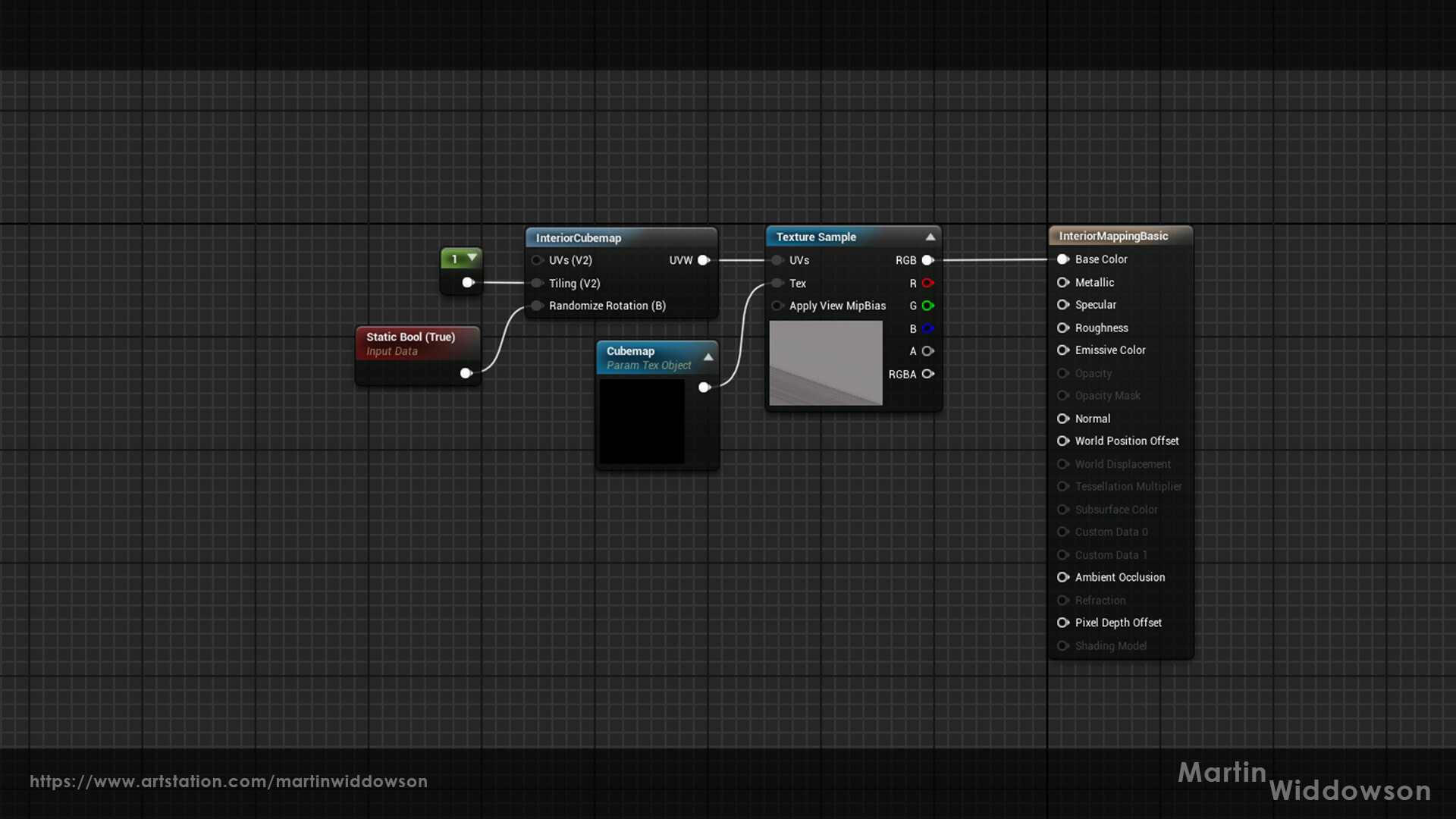
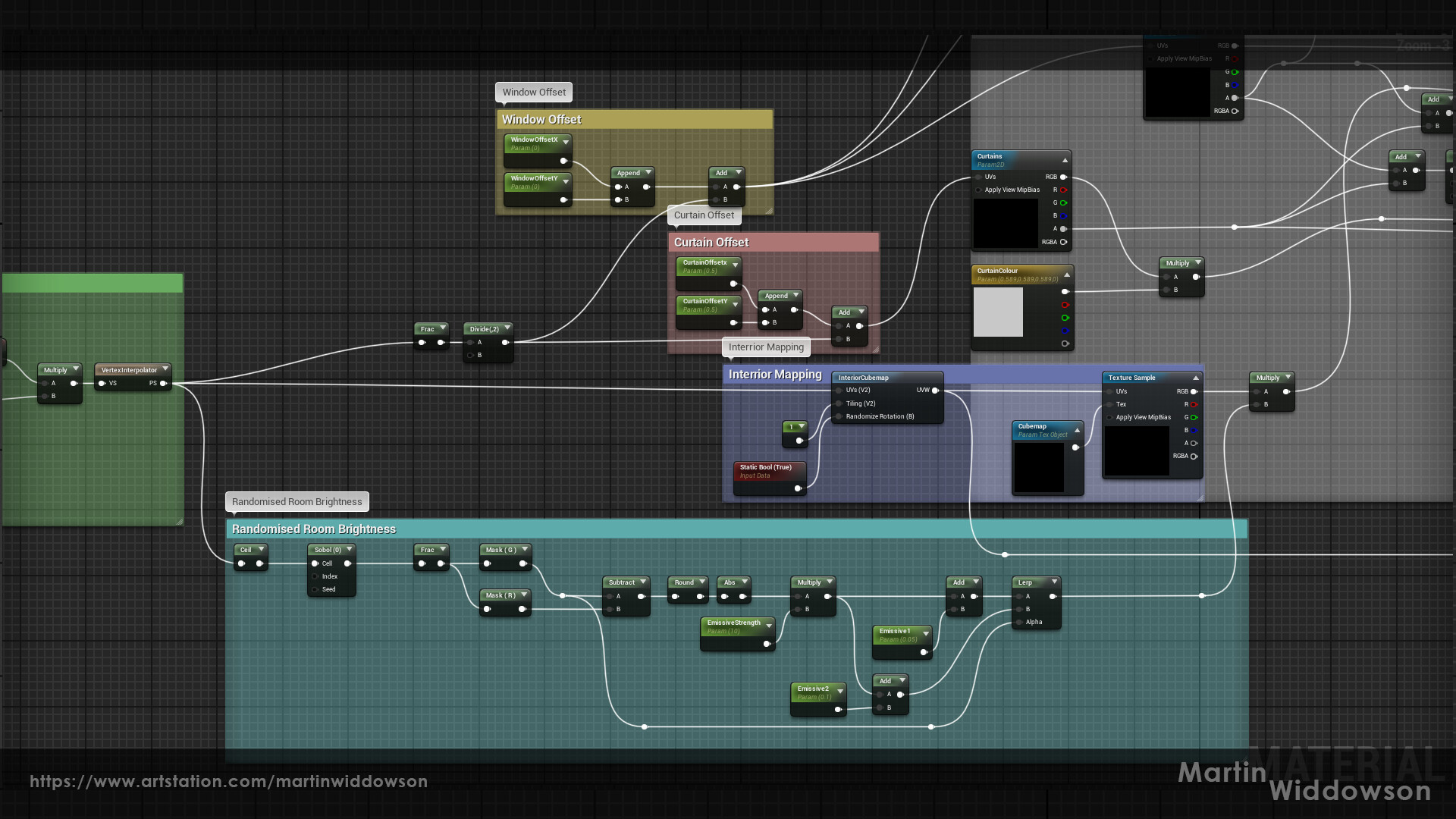
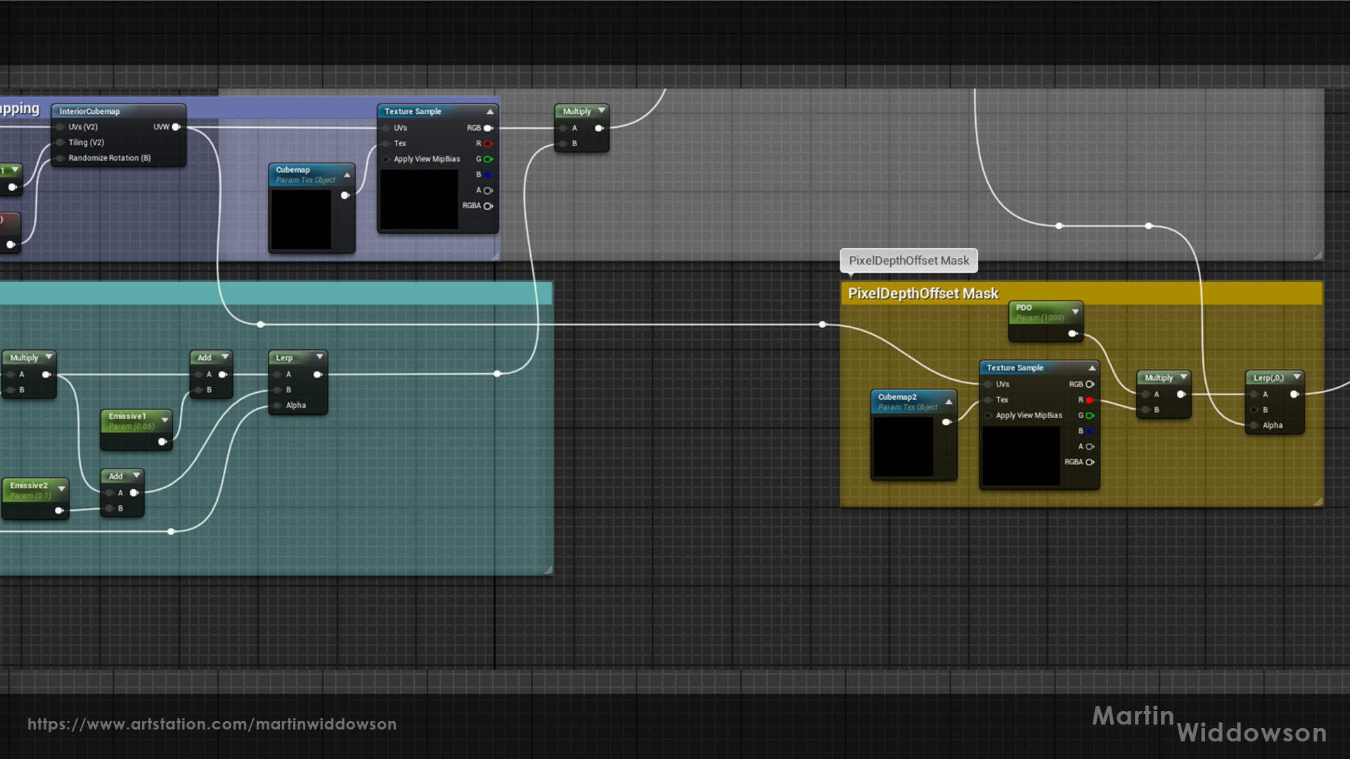
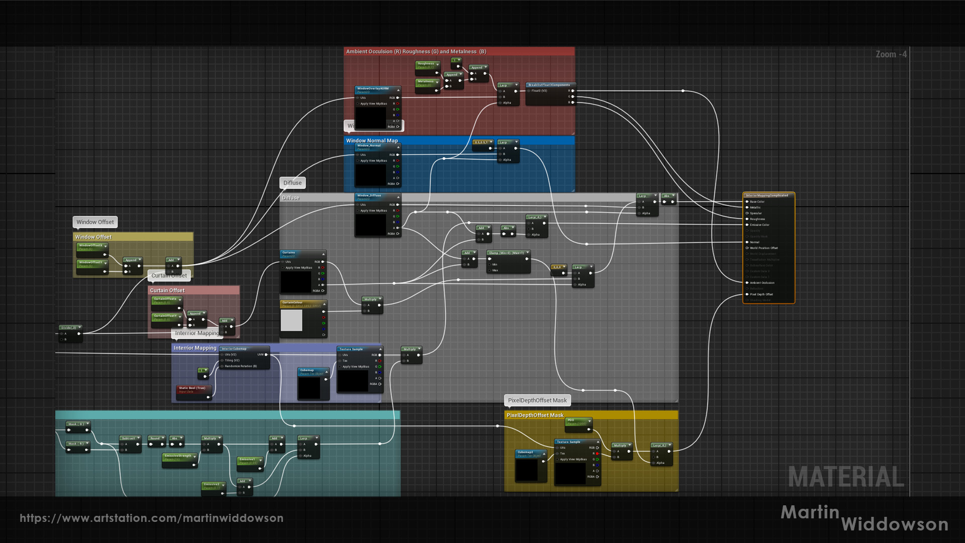
One of the game's biggest technical hurdles was how to render an entire level while hiding it behind an artificial boundary, maintaining a large open area. I was tasked with creating a virtual production stage, inspired by hexagonal LCD panels.

The shader I developed used an alpha mask that gradually revealed more of the stage in a broken, jittering state. To achieve this, I designed the colour reveal to mimic the behaviour of real RGB pixels, increasing and decreasing their values according to the underlying texture.
Project Juice
With Ascending Inferno now running at a stable 60 frames per second, and shaders finalized, I shifted focus towards adding smaller details and interactive elements that could deepen the player's immersion. The goal was to fill the levels with objects that players could interact with or that would interact with them, creating a world that felt alive and responsive. This part of development focused on adding easter eggs, player-triggered interactions, and various “juice” elements to enhance the overall experience.
Lust: The Staring Eyes
One of the first interactive elements I developed was for Lust, a level filled with hundreds of eerie eyes scattered throughout the environment. These eyes were meant to act like cameras, always watching the player no matter where they moved.
Initially, I implemented this using a blueprint setup, which resulted in each of the 400-500 eye cameras being constantly active. Unfortunately, this tanked the frame rate, dropping it as low as 10 frames per second. To resolve this, I rewrote the blueprint so that the eyes would only activate when the player entered a specific trigger area. While this improved performance, a side effect of chunked level loading caused the eyes to lose track of the player after each load, resulting in periodic lag spikes.
After multiple attempts, I settled on a simpler solution—moving the eye movement to the shader. I had hoped to create a fully functional 3D rotation that would track the player’s movements but ran into limitations in my knowledge of vertex shader math. Instead, I made the eyes sweep back and forth on a set trajectory. Although I initially saw this as a compromise, playtesting revealed it was more engaging: more players noticed the sweeping motion than had noticed the original player-tracking version, so in the end, it was a happy accident.
Fraud: Virtual Production Cameras
Next, I worked on interactive cameras for the virtual production set in Fraud. These cameras, unlike the ones in Lust, were large filming cameras placed on tracks. Since there were only 2-4 cameras per scene, I didn’t have to worry about performance issues. I recycled much of the code from the Lust eyes blueprint and adapted it for this new purpose. With fewer cameras, even with chunked loading, performance remained stable.
Dynamic Lighting: Gradients Based on Player Movement
With Ben’s assistance, I worked on dynamic lighting that could shift based on the player's position. This effect was inspired by the team’s desire for lighting to reflect the emotional and visual tone of each level dynamically.
Using the player’s location as a reference, I sampled a colour curve to change the directional and skylights in real-time. Later, I expanded this feature to modify exponential height fog, allowing us to change its colour, density, and refraction based on the same system. This adaptive lighting helped keep the game visually fresh, adding subtle atmosphere shifts as players traversed each level.
Gluttony: The TV Easter Egg
In Gluttony, I was tasked with creating a working television set for the diner level. Initially, I experimented with smaller TVs scattered around the scene but found they lacked impact. Instead, I placed a single large TV that players could interact with.
Inspired by the chaotic nature of the level, I added a mechanic where kicking Vincent (the character) into the TV would cycle through channels until the television broke. To add a fun easter egg, I inserted a hidden video of my cat. If players hit the broken TV enough times, they would be rewarded with a short clip of my cat on-screen, adding a personal touch to the game.
Gluttony: Conveyor Belts and Trash Physics
While working on Gluttony, I noticed that the conveyor belts running through the lower levels needed more "juice." I experimented with allowing the player to kick objects off the belts. However, due to the way the belts were set up, it was tricky to get the interaction to feel natural.
Eventually, I found that adding a small collider to detect player momentum and applying it to the trash objects worked, but the interaction remained difficult to control. Although it wasn't perfect, the mechanic added a nice touch of interactivity to the level, making it feel more dynamic.
Interactive Platforms: Shimmy Without Collision
To make some of the platforms react to player inputs, we decided to add a shimmying effect when players jumped on them. However, the platforms couldn’t alter their collision or physically move the player or ball, so the effect had to be purely visual. This turned out to be more challenging than simply rotating an object, so I developed a solution using a shader.
The shader rotated the model based on a pivot point using a timeline defined in an external blueprint. While this method worked well and looked great, setting it up for each platform was time-consuming, so it wasn’t as widely implemented as I would have liked by the project’s end.
Violence: The Fighting Game Easter Egg
In Violence, Chris (our pixel artist) and I collaborated on a fun easter egg inspired by discussions about how video games allegedly cause violence. We thought it would be a nice touch to add a pixel-art fighting game in the background of this level.
Chris created pixel art sprites of the fighters, while I handled the shaders for the health bars and the infinite timer. I also scripted a blueprint that would toggle through the various fight states. Initially, the fighters were meant to be Chris and myself, but we later decided to reference all the developers in Ascending Inferno by cycling our names in the fight roster. This led to amusing moments during playtesting, as we’d stop and watch the characters fight to see who was winning that day. It became a fun, light-hearted feature that consistently drew laughs from my fellow developers.
World Building Blueprints
While the “juice” added flair and personality to Ascending Inferno, the backbone of the immersive experience was built on the carefully constructed world-building blueprints. These blueprints ensured that the game world could be created efficiently while maintaining the desired level of detail and atmosphere. Initially, several blueprints were already in place when I joined the project, but as development continued, it became apparent that additional, more specialized blueprints were necessary to meet the creative and technical demands.
Spline Follower Blueprint: Trains, Rats, and More
The first significant blueprint I worked on was a spline follower. This was pivotal for creating animated world elements like planes flying in the sky, rats scurrying along the ground, and trains moving along the tracks in Heresy.
The spline follower allowed us to lay out a path for these elements to follow smoothly. However, as we used this blueprint across various levels, one limitation became clear, there was no way to instance meshes along the same spline. This resulted in us duplicating the spline and manually offsetting objects, which became tedious, especially in Heresy, where both the tracks and the trains needed to follow the same path. Next time I work on a similar feature, I plan to include the ability to instance meshes directly along the spline, saving both time and effort.
Dynamic Lighting Blueprint: Adjusting for Quality Settings
Another critical blueprint I created was for dynamic lighting adjustments. This was born out of an issue we encountered while switching between high and low-quality settings. Our game relied heavily on Lumen (Unreal Engine’s global illumination system) and emissive materials to create the proper lighting ambiance. However, when switching to lower quality settings, the lighting in certain areas would fall flat, leading to a lack of depth.
To address this, I built a small blueprint that took the current quality settings into account. The blueprint would assess whether the emissive materials alone were sufficient to light the area or if additional light sources should be enabled. This was a fascinating technical challenge, and it’s something I hope we can further streamline in future projects to avoid needing such workarounds.
Clothesline Blueprint: Decorating Greed’s Underground
In Greed, we wanted to create a slums-like underground environment filled with clotheslines to help bring the space to life. Hand-placing each clothesline in Unreal Engine would have been a time-consuming task and building them as single-purpose in Blender would lack the flexibility we needed.
To solve this, I created a dynamic clothesline blueprint that allowed us to quickly scale and adjust the lines and the number of clothes hanging from them. This blueprint allowed the artists to scatter dozens of clotheslines throughout the underground area, giving the level a lived-in, chaotic look without requiring manual placement of each item.
Skybox and Layer Transitions: Seamless Vertical Biomes
One of the major visual challenges we faced was the vertical nature of the game. Each biome in Ascending Inferno needed to feel distinct and self-contained, but we also wanted to create the illusion of a continuous world.
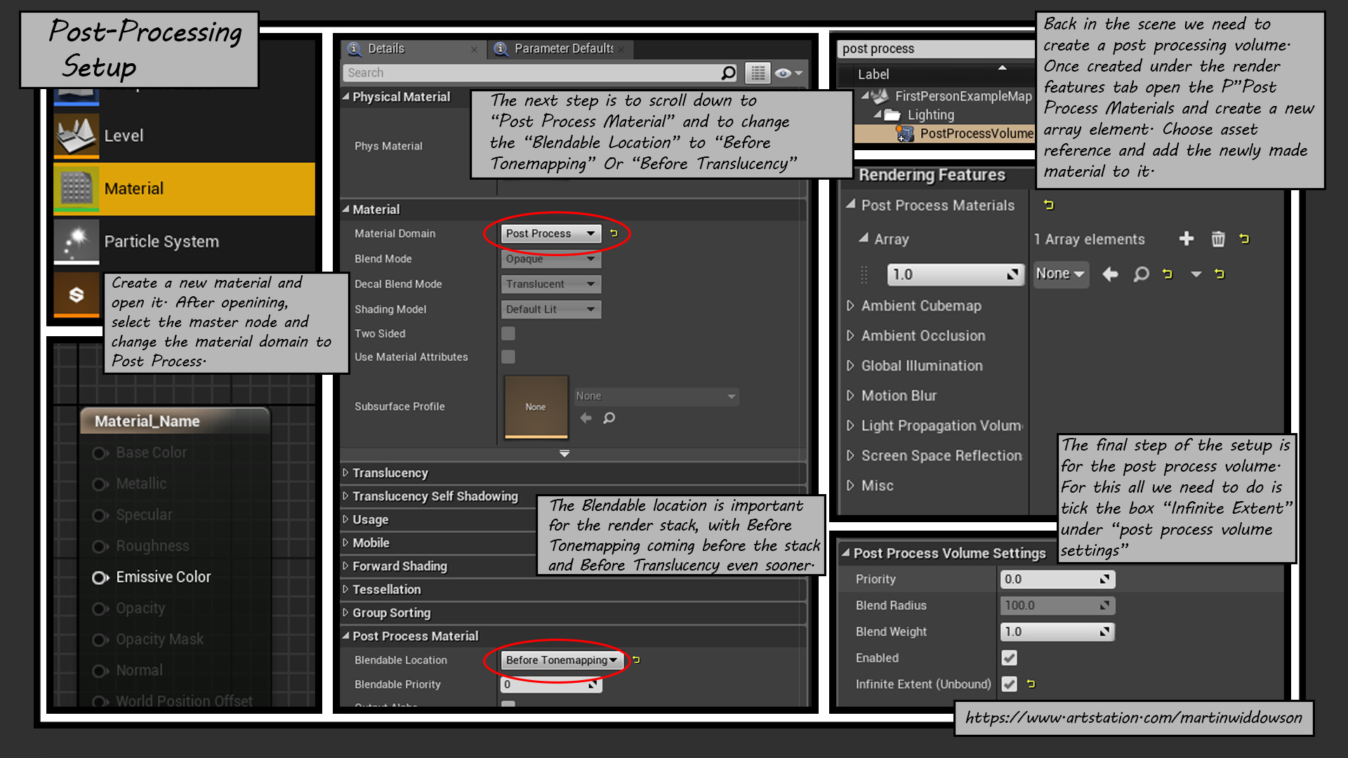
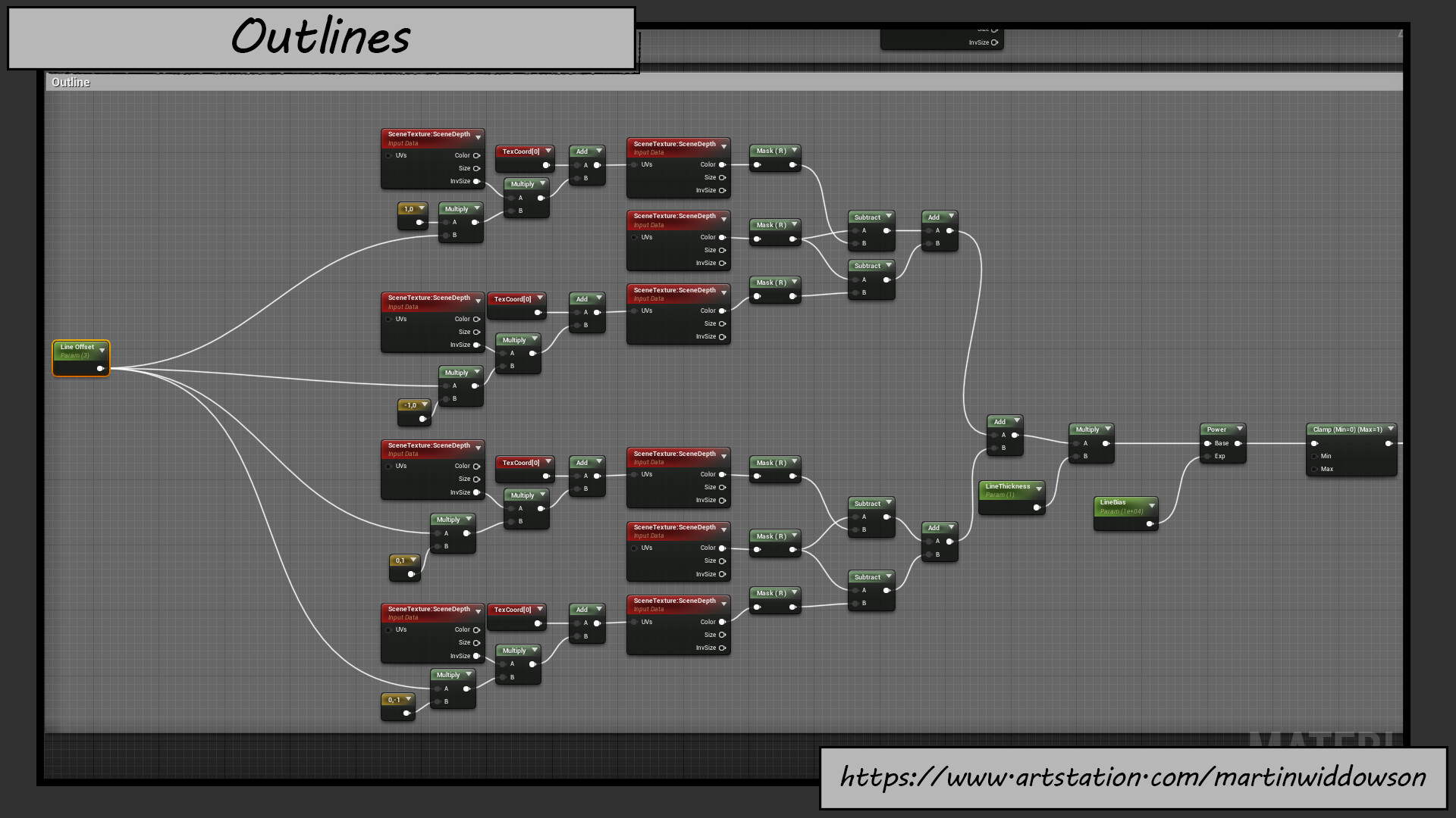
To accomplish this, we opted for a fake skybox system that would wrap around and between each biome. The challenge, however, was making sure the transition between biomes appeared smooth. Without an object to block the view, the sky would continue into the camera plane, creating a jarring visual. To solve this, I used a custom depth pass to create cut-outs in the skybox, allowing for clean transitions between biomes. This maintained the illusion of a large, seamless world while allowing players to move vertically between different levels.
Parallax Backgrounds and Large Artwork: Solving Clipping Issues
The last major blueprint I worked on tackled a significant issue we faced with our parallax background art. For many levels, we split the background artwork into several layers to create a parallax effect, where objects at different distances would move at varying speeds as the player moved. These background layers were often hundreds of units tall and wide, sometimes clipping with skyboxes or other levels.
The most noticeable issue occurred in Lust, where a giant demon and a disco ball were part of the background art. As players progressed closer to Gluttony, the level geometry and meshes began covering the background art, breaking the illusion that the demon and disco ball were far away in the distance.
To fix this, I used a clever technique involving the camera position and screen-space UVs. Instead of displaying the demon and disco ball as part of the background layers, I projected them onto the skybox itself. This projection was paired with a slow offset, mimicking the parallax movement we initially desired. This solution allowed the demon and disco ball to remain visible and convincing, regardless of the player's location, without the risk of clipping through the environment. On the other hand, while this technique worked well, it also appeared in the main menu flythrough cameras meaning those had to be curated around the skybox limitation.
Set Dressing & Level Construction Challenges
The set dressing and level construction process for Ascending Inferno was highly collaborative, with each artist contributing to the creation and refinement of the game world. While many contributions were a joint effort and hard to define individually, there were certain aspects of the process that are clearly identifiable as my own work.
Setting the Mood: Initial Look Development
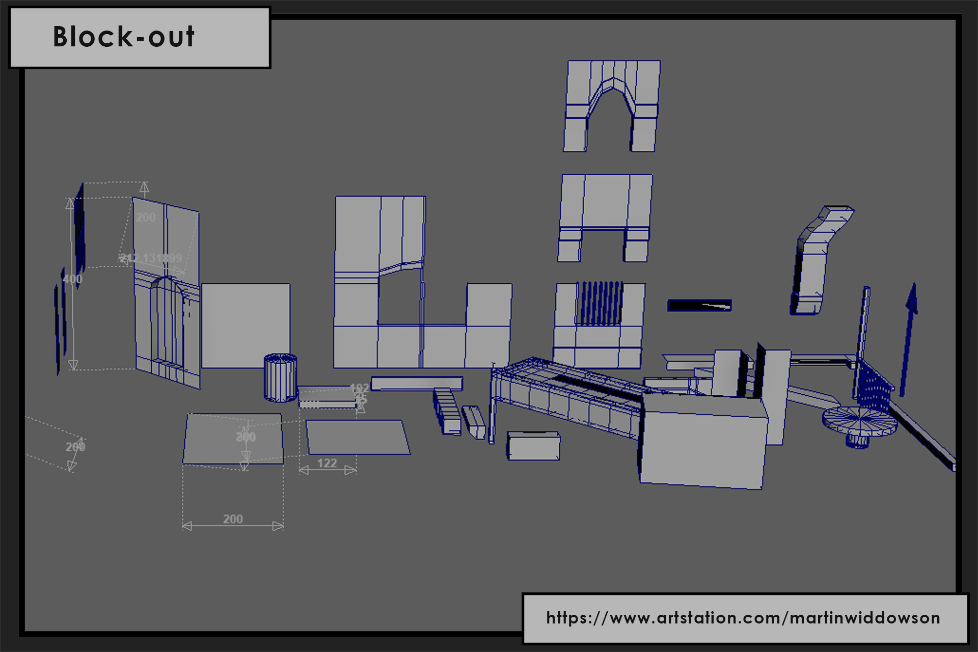
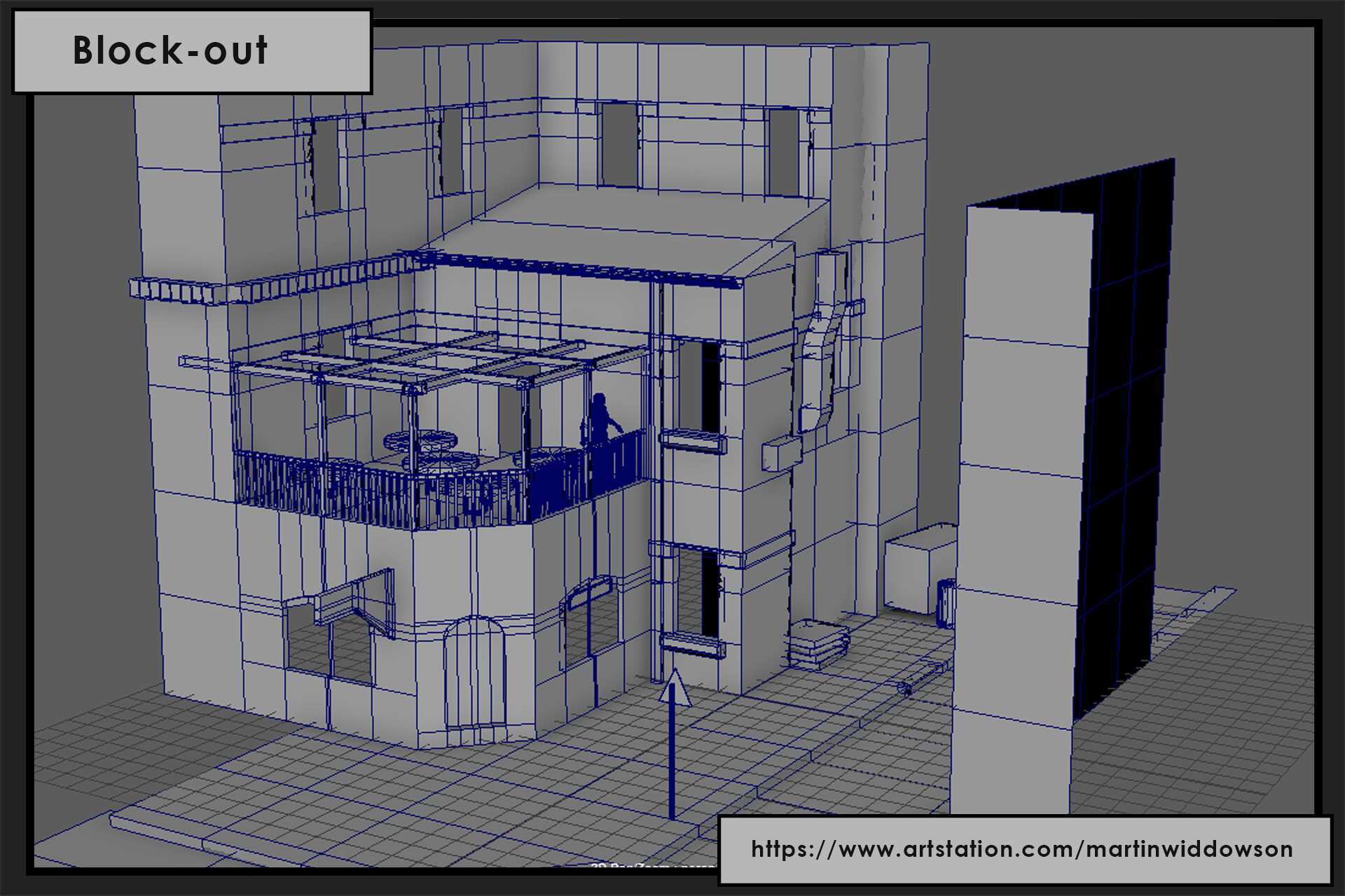
In the early stages of each level’s development sprint, my primary focus was on establishing the general feel and look of the level. This included spending several days working on the blockout, filling it with generic assets such as rocks, walls, windows, and doors. During this time, I also focused on material and texture creation to drive the look-development process and give the levels a clear aesthetic foundation.
While I worked on these foundational elements, the other 3D artists, Ricky and Lachlan, focused on creating unique props to further enrich the environment. These props, ranging from scattered debris to interactable objects, would later fill out the levels and provide them with detail and personality.
Alongside this, I also began the first pass on lighting for each scene. This initial lighting setup mainly involved directional and skylights, as it allowed us to get a rough idea of how the lighting would interact with the environment and assets as the level progressed.
Lighting for Atmosphere: Establishing Distinct Biomes
As the levels became more fleshed out and moved toward their final form, I turned my attention to lighting the levels to create a cohesive atmosphere. My goal was to use distinct colour palettes to reflect the themes and emotional tones of each biome. For example, the clearest colour choices were:
- Red for Anger
- Blue for Sadness
- Yellow for Hunger
These colours not only added to the emotional weight of each area but also helped create a strong visual identity for each biome.
Some biomes, such as Treachery, which featured ice and frozen landscapes, were naturally suited for cool whites, blues, and turquoises. By using lighting that evoked coldness and isolation, we further emphasized the thematic qualities of treachery, drawing players into the oppressive atmosphere of the level.
Secret Rooms and Emblems: Visual Cues for Players
During the development of secret rooms, we faced the challenge of helping players identify and remember which rooms belonged to which biome. To solve this, we developed a set of emblems to serve as visual indicators. Each emblem corresponded to a specific demon and biome, and their colours were matched with the lighting of their respective level.
This colour-coding system provided a clear visual connection between the secret rooms and their respective biomes, making it easier for players to recognize rooms they had missed. These emblems also reinforced the overall mood of each biome, as they were designed to blend harmoniously with the lighting and overall aesthetic.
Set Dressing Challenges: Evolving Environments
One of the main challenges in set dressing was the evolution of the levels over time. As props were created and the levels matured, it often became necessary to revisit earlier set dressing decisions. What seemed like a simple task of placing objects initially became more complex as new assets, textures, and lighting changes were introduced.
For example, there were instances where:
- Textures created early on clashed with newly developed assets, requiring re-texturing or re-mapping.
- The addition of new props meant that certain objects had to be rearranged or removed to maintain a consistent look and avoid cluttering the scene.
- Lighting changes sometimes drastically altered the feel of a level, making certain set dressing elements feel out of place or misaligned with the new atmosphere.
This iterative process meant that set dressing was rarely a “one-and-done” task, but rather something that needed to be continually refined as the game world evolved. The team had to balance creative freedom with the constraints of level design, ensuring that each level felt immersive while still serving the overall gameplay and progression.
Turntables: Crafting Immersive Character Customisation
As we neared the final stages of production, one of the key features we focused on was creating a visually engaging character customizer. Initially, the plan was simple: the player would be teleported to a generic room, customize their character, and then return to the game. However, this approach felt somewhat detached from the game's immersive experience.
I was later assigned the exciting task of designing unique customization environments for each level. Rather than taking the player out of the world, this new approach allowed them to stay connected with their surroundings by transporting them to a customization room that reflected the style and theme of the current level. This added a layer of immersion to the character creation process, making it feel more like a natural part of the game world rather than an isolated feature.
Each customization room was carefully designed with its own distinct visual identity, aligning with the tone, mood, and aesthetic of its respective level. This was a fun and challenging aspect of development, as it required pulling in familiar elements from throughout the level to ensure continuity, while also incorporating visual effects that elevated the overall experience.
If you're interested in seeing these unique rooms, you can check them out [here]!
Character Customiser: Adding Wings, Hats and Trails
After finalizing the customizer rooms, I moved on to creating some fun and thematic cosmetics for Vincent. These included a variety of wings, hats, and trails that players could unlock by achieving certain milestones, such as completing level-specific achievements. The goal was to give players a visual reward tied to their progression, adding a layer of personalization to their character.
Each set of cosmetics was inspired by the levels themselves, reflecting the themes and aesthetics of the world Vincent was exploring. While many of the levels had clear visual motifs to draw from, a few proved to be more challenging in terms of translating their essence into cosmetics—most notably, Greed and Violence. Finding ways to visually represent those abstract ideas in a cohesive and appealing way took some creative experimentation.
If you would like to see them in more detail, go [here]!
Automatic Scalability Options
The final feature I’d like to discuss is the automatic quality scaling system I developed. Rather than forcing players to manually adjust their settings, we wanted an option that would automatically optimize performance based on the players hardware capabilities.
The system is initiated when the game detects that its running below our minimum target framerate (50fps). When it detects poor framerate a UI element is presented to the player to initiate the automatic quality settings, where if accepted, will cycle through various settings such as texture quality, shadows, global illumination and shader complexity. It will gradually lower each setting until the game achieves a sustainable framerate.
Importantly, I made the design choice to handle this inside the main menu, before the player has an opportunity to play the game. This ensures that players are never distracted or disrupted by performance drops during critical moments as the adjustments can take place before the game even starts. Given our menus are full 3D scenes reflecting that of the game, it gives us a close approximation of the expected framerate while in gameplay.
In this way, the player enters the game world with optimal settings, without the need to tinker or experience frustrating performance drops. We can’t expect the player to know what each individual setting will do, so taking an automatic approach simplifies it a lot for them and creates a better game experience. You can check out how it works in the video below!
Conclusions
Looking back on the journey of working on this project, I can see how each piece I contributed has played a crucial role in shaping the final product. I’ve had the opportunity to collaborate with incredibly talented artists, designers, programmers and musicians, and in the process I’ve both taught and learned so much. Working on Ascending Inferno was both challenging, yet incredibly rewarding, allowing me to further myself as a technical artist.
One of the most fulfilling aspects was seeing how all these elements came together to create a cohesive experience for the player. Whether it was crafting the visual effects that enhanced gameplay or working through the intricacies of world-building, every step helped build a world that players could get lost in. And even though some contributions, like the screen-space overlays, may go unnoticed by the casual player, knowing how much they add to the overall immersion made every hurdle worth it.
As this project draws to a close, I find myself reflecting not just on the technical accomplishments, but also on the creative collaborations that made everything possible. Each shader tweak, lighting adjustment, and prop placement has been a step toward realizing the team's vision — and it’s something I’m incredibly proud to have been a part of.
Moving forward, I’m excited to see how players interact with the world we’ve built and where my next projects will take me. Every game is a new opportunity to learn, create, and push the boundaries of what's possible. I can’t wait for the next adventure, and I hope you’ll be there to experience it with me.